Design Inspiration
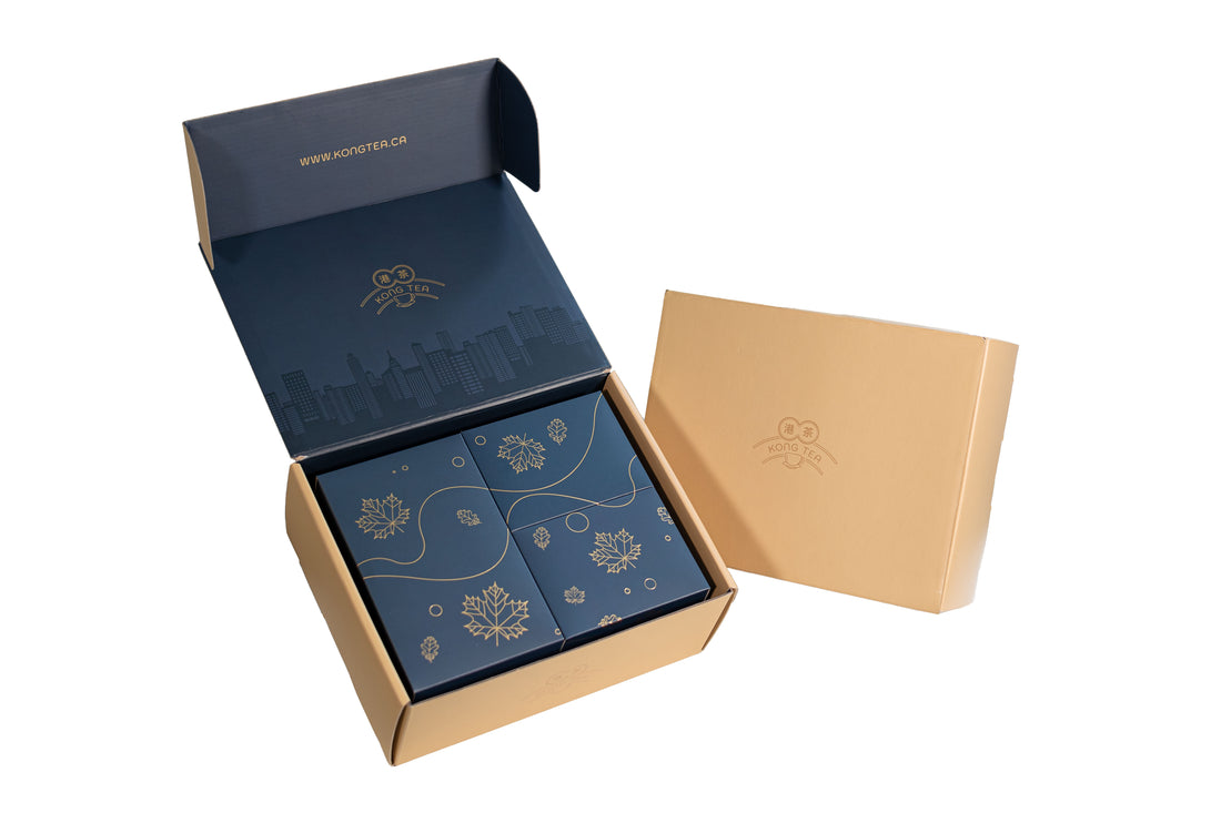
The design of Deluxe Box Set has received amazing response from our customers. What's so special about this design?
First of all, the color. The choice of gold offers a premium image, and is truly a differentiator among many tea competitors, not just the design, but also the premium ingredients we emphasize.
In the front and rear sides of the box, there are iconic buildings and skyscrapers found in Hong Kong, the hometown of the two founders, as well as the origins of some of our products. Making use of ultra violet (UV) coating, these buildings are seen to be in subtle depth contrast, presenting a 3D visual effect in a 2D layout.


Interior:
The choice of navy blue inside is a sharp contrast against the gold color on the exterior. But the contrast game does not end here. We utilize hot stamping on our logo and website against the navy blue background to look sharp and premium. On the backside of the cover, there are also tall buildings underneath our logo, but only in a subtly dark manner, so that they don't get too much attention, yet still a good reminder that tall buildings are seen everywhere in Hong Kong.

Core:
Obviously, the products are placed at the core part of the packaging. Inside the packaging, there are 1 bigger box on the left and 2 smaller boxes on the right. The 3 core elements in each of our products, namely 1) tea and filters, 2) evaporated milk or freeze-dried fruits, and 3) sugar (white or maple), are separately put inside each of the 3 boxes.
These 3 boxes together form an artistic puzzle that is totally Canadian - maple leaves in the chill. The design also serves as a good reminder that all our ingredients (except tea) are locally sourced in Canada. And again, we make use of hot stamping on shapes and patterns against the navy blue background for an impressive contrast.

Pouches:
The design of pouches is deliberately toned down, because they have to be simple and easily understood. They contain either 1) tea, 2) freeze-dried fruits, or 3) sugar (white or maple), and they are printed exactly as what they are. Colors are also carefully selected to reflect what the pouches actually contain, i.e. black for tea, green for fruits, and yellow for sugar. However, despite the low profile, the design remains elegant and modern.


Stickers:
Each of our 4 products has its own distinct product sticker. Each sticker has two scribbled characters on it, they resemble the hand written order notes with scribbles that we can see in actual Cha Chaan Tengs in Hong Kong. This culture definitely has an strong impression for everyone who has visited a Cha Chaan Teng in Hong Kong and having it on our products echoes our mission of bringing local flavors and culture of Hong Kong to major cities around the world!


